“A brand does not begin or end with a logo and a sweet set of fonts and colors. Your brand is your voice.”
– Natalia Martinez, the Labs & Co.
Brand.
Oh how I love this word. I love how it looks, how it sounds, what it means. I love how brands stir us. Inspire us. Most of all… I love building brands. Taking a small gem of an idea, giving it space and lighting it up… finding its story and uncovering its edges, crafting something beautiful and smart… making it personal, meaningful and desirable… gradually, gently or all at once, adding the extra to ordinary.
Out in the world I often see the word ‘brand’ and the word ‘business’ used as synonyms, which is misleading. A business does not necessarily get to claim brand status, and vice versa. A brand can be a person, a country, a social status or an event… and of course, a business can easily exist for ages without ever truly actualizing into a brand.
It is my great mission to help my clients move beyond just owning a business (making some products, having a website and a logo… then trying to tackle that crazy thing called marketing)… No. I encourage them to truly become architects of a brand.
** If this topic interests you, you’ll definitely want to check out my book the Million Dollar Dog Brand – which explores how some of the most successful pet brands in the world (Ruffwear, Barkbox, Planet Dog and more…) started in the mind of just one person, and become global sensations. It’s not about luck!
Want more great resources like this?
But branding is so expensive!
Building a business absent of a strong brand, can sometimes seem cheaper or less risky short-term, but long-term, ignoring or failing to invest in your brand leads to MUCH harder work.
…and can often lead to a need to compete based on price (which occurs when the only way you stand out in the market or get clients is to have the lowest price) this is not good for you, your client, or the market you operate in.
Competing based on price can be the most expensive strategy of all – this a fate we definitely want to avoid.
One more quick note before we dive in.
I know many of you already know the power of branding – you might even be obsessing already over creating your own (or elements of your own, like a logo or a website). As you embark on this article, I want to make it clear that I do not believe the act of ‘branding’ (ie, hiring someone to do a logo or spending 17.4 hours on pinterest looking at color palettes) is a good use of excessive amounts of time when you have more pressing tasks to do that lead you directly to revenue (like editing that session, calling that lead or selling at that event). Branding is a 24/7, iterative process and it should be eased into a regular part of your work routine…
Do not halt your other business activities or stop moving forward until you ‘finish your brand’ – keep moving, keep hustling, the brand will evolve. When you launch it, most people won’t notice, care, or even remember what it was before!
In other words, do not use ‘branding’ as a fun and exciting excuse not to do the icky work you’d rather not do. Despite my enthusiasm about the importance of branding – you do not have my permission to cease selling in order to obsess over your logo!
LESSON IN ACTION
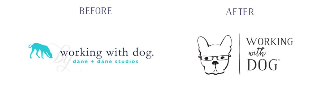
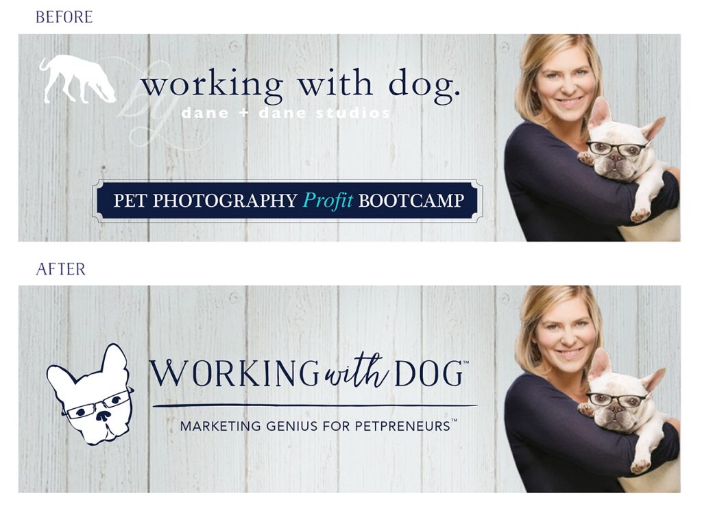
When I started Working with Dog – I didn’t have a logo – I just typed the words ‘working with dog’ in my dane + dane font, and chucked it up there with my dane logo and a photo (and trust me, that made me squirm). I launched Bootcamp, my mailing list and some other goodies BEFORE I was ready, BEFORE I had a logo. I am a branding expert, but Working with Dog made tens of thousands of dollars BEFORE the logo even existed – because I knew I had to test the model and create the revenue before investing in branding.
Let’s Get You Organized!
This whole article is about helping you organize your visual brand goodies into a document (ideally a PDF) that you can use to guide all your marketing adventures – whether you DIY everything, or hire people to help you create stuff – this resource will save you SO MUCH time AND lead to much more effective, aesthetically pleasing marketing assets.
There are two tracks you can take to complete the exercises below:
You can DIY (Do it Yourself) or you can DELEGATE (have someone help you). You can mix and match these strategies for each exercise (try some things yourself and delegate others) but make sure you schedule a time (or a series of times) to DO or DELEGATE THE WORK!
Lets Get Started
“Brand Guidelines are an incredibly handy to tool to help keep your voice consistent, whether you are a team of one, or 100.”
– Natalia Martinez, the Labs & Co.
The resource we are calling ‘Brand Guidelines’ is known by several other names: ‘style guide’ ‘brand bible’ ‘visual style guide’ ‘identity style guide’ ‘design guidelines’ ‘style manual’ ‘brand book’ ‘corporate identity guidelines’ blah, blah etc. What you call it is unimportant.
What does matter is WHY you are creating it… what do you intend to do with it? You can tailor Brand Guidelines to specific projects (like a style guide for your website, for example) or for specific people (design guidelines are usually created specifically for designers and ‘pattern libraries’ are created for coders) but if you’re just getting started, I would suggest you consider your Brand Guidelines to be your time-saving ‘cheat sheet’ where all the visual elements of your brand are put together, simply explained and easy to access.
Working from one document, or set of rules, ensures that every time you commission someone new or make something yourself for your business (an ad, a web page, a model call, packaging etc.) you’re not starting from scratch. This saves time and leads to consistent branding, and according to our Dogly Principles, consistency is something we care about!
The number one reason I suggest creating brand guidelines, is to ensure that your brand is presented consistently across all platforms.
5 Dogly Principles
- Generosity
- Simplicity
- Authenticity
- Consistency
- Quality
More about the 5 Dogly Principles
Goal.
We aim to build a unified, recognizable brand (creating ‘brand recognition’) by creating messages and materials that are ridiculously consistent.
As you grow, keeping absolute consistency across all products, communications, channels and partnerships is harder than it looks!
So how do we do it?
1. You know me, I love to start with the ‘Why’.
This is your reason for existing, so it’s only logical at the intro to your brand guidelines should include some messaging that gets the reader excited about and invested in the brand.
Here’s how ‘Why’ often shows up in Brand Guidelines:
- Brand Manifesto
- Brand Promise
- Brand Pillars / Guiding Principles (Choose between 1-5)
- Statement of Purpose (mission / vision statement)
- Brand story (Your STORY about why your brand exists)
— (google any of these concepts to see examples) —
Exercise #1: Write your story.
Brainstorm:
Do some free writing about your ‘Why’. Really let go of trying to create a bio or sell, just tell a story, list words, write dialogue, list sense experiences… You can draw pictures, write a poem, make a spreadsheet, whatever allows you to dig in to your most personal, real and honest words and feelings – just make sure it relates to WHY your BRAND EXISTS
THEN
D.I.Y Action:
Take your free-writing and highlight the bits you find the most powerful. Ask some other people you trust to do the same. Cut and paste or scribble and circle – the process doesn’t matter, but what you want to do is cut out anything extraneous. Don’t leave words in for the sake of words. Strip it back. Decide which one of the above formats you’d like to use (manifesto, brand pillars, story, etc.) and start dicing your writing into that format.
OR
Delegate Action:
Hire a copy writer to take your words and ideas and make them into some compelling brand copy that you can use and reuse. This is an investment I recommend if you are your own product, or if you intend to seek any kind of press coverage or rely on packaging or sales pages to sell your products from (basically, I always recommend this investment if you can’t find compelling words to explain your ‘Why’!)
2. How Does Your ‘Why’ Show Up?
This is the core of the ‘Brand Guidelines’ content. Setting expectations (and organizing) the items in your ‘Marketing Toy Box’, which, to review are:
Marketing Toy Box
- Images
- Color
- Graphics / Icons
- Space
- Words/Text
- Audio / Video
- Touch / Texture
- Smell / Taste
- Social Proof
- X factor
More about the Marketing Toy Box
3 Core Brand Elements:
For the sake of simplicity (another one of those Dogly Principles) I am going to suggest that, after your ‘Why’, you focus the document around only three core elements:
Logo, Color and Font.
This is not ‘law’ – and there are examples at the end of this article which show all kinds of variations (for example, the Dog is Good one is MEGA because we licensed our brand – so each individual product-line is outlined and specified) but you can easily get by with the basics for now.
If you’re looking to expand on this basic version, I suggest you add:
‘imagery’ (guiding principles for the photos you use in your marketing)
‘illustration’ (graphics you use that tell your brand story: icons, drawings, watercolors),
‘voice’ (words and copy you use and don’t use)
‘in action’ (this is the ‘what’ you do shows up – it is nice to see your complete marketing materials [website, postcard, business card] and/or your products, next to your branding to ensure they remain true to your brand guidelines).
You can add any number of categories you want to tell the story of your brand (ex. certifications, press/awards, social cause elements [partner brands etc.], P.O.P displays, the list goes on…)
Ok ok enough chatter, let’s go!
1. Logo
The logo is the centerpiece of the Brand Guidelines or Style Guide document. This is where you can express exactly how, where and in what way your logo should and should NOT be used. This is especially important for Trademarked brands, to indicate the use of the ® or the ™ symbols on the appropriate products / identities. It is also a good idea to indicate which is the ‘primary’ logo (to be used most often) and which are ‘backups’ or ‘variations’ for different purposes.
Goal.
In this section, you want to show the do’s and do not’s of both your ‘Icon’ if you have one, and/or your ‘Wordmark’ if you have one. See below…
Be sure to include:
- Size / Shape Options (square, horiz, vert, circle)
- Color / Reverse (light on dark vs. dark on light)
- Word vs. Icon
- Occasion (when/where each version should appear)
- Space
SAMPLE: DOG IS GOOD
![]()
![]()
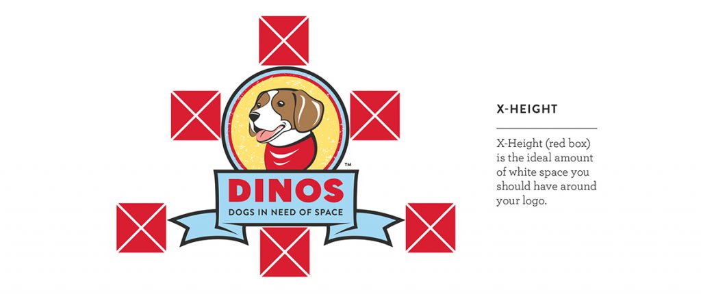
Space
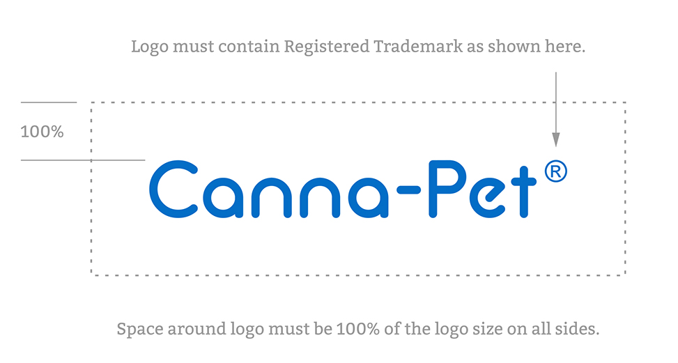
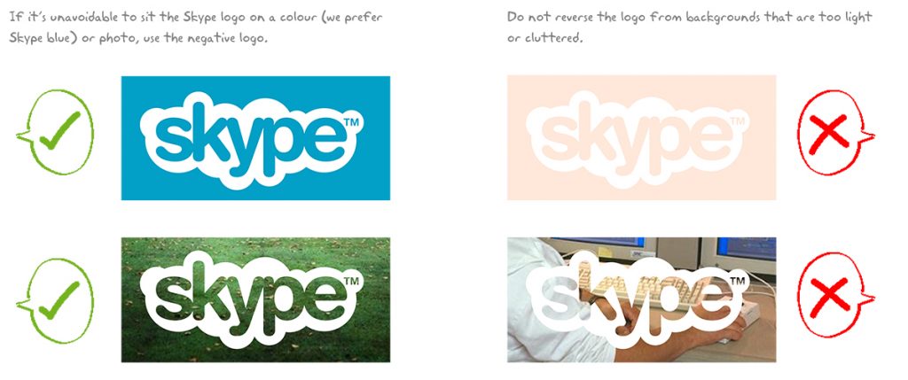
One of the important elements of your logo, is describing how much space should be left around it, or what can and cannot go behind it, so that it doesn’t get crammed awkwardly into corners or dumped on top of horrible colors or busy images…
SAMPLE: DINOS by the Labs & Co.
SAMPLE: Canna-Pet
SAMPLE: SKYPE
Exercise #2: Your Logo.
![]() (If you have a logo) Find some things (brochures, business cards, web pages etc.) that you’ve created, or ways you’ve used your logo that you really LIKE. That you think really sum-up the way it should be represented out in the world. Pick them apart.
(If you have a logo) Find some things (brochures, business cards, web pages etc.) that you’ve created, or ways you’ve used your logo that you really LIKE. That you think really sum-up the way it should be represented out in the world. Pick them apart.
Draw ‘x’ in the space around the logo or draw a box around it to indicate the ‘breathing room’ you like it to have. Look at the different versions you use and where you need them and what you need them for (ie packaging, letterhead, web [transparent background, non-transparent background], color-ways etc., and start to gather the digital versions (high-res psd, ai, or eps files ideally) together in a folder on your computer.
(If you don’t have a logo – go to ‘delegate’!)
THEN
D.I.Y Action:
Take the assets you collected and use whatever means necessary (see ‘design’ at the end of this article if you need help with ‘how’) to translate what you’ve marked up on paper, into your guidelines. Cut + paste or drag + drop different versions of your logo that you use most often – making sure to include the versions listed above (the example ‘brand guidelines’ at the end will be helpful examples to follow too!)
OR
Delegate Action:
Ask your designer for ‘logo lockups’ – or for versions of your logo from the list above (horiz, vert, transparent background etc.) Easy!
A strong logo should be versatile. It needs to thrive in a world saturated with trends and visual candy. – Nat Martinez, the Labs & Co.
2. Color
One of the quickest routes to human emotion, color is an essential piece of your efficacy as a brand. Having a standard palette or ‘color story’ that you stick with throughout your marketing, really keeps your materials complimentary. That doesn’t mean you can only ever use one or two colors! Choosing ‘primary’ (main) ‘secondary’ and ‘tertiary’ colors helps prioritize which colors are used most often. This hierarchy helps make it easy to know which colors to start with (based on the feelings you’re trying to convey / what matches your product / web site etc.) but you can always add to the foundation those colors provide.
Goal.
The goal with this section is to make sure that anyone can pick up your brand guidelines and create marketing assets for you using the exact colors you use on everything else, prioritizing the colors you use most, first!
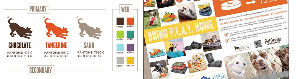
SAMPLE: Canna-Pet

What do all the numbers mean?
The most important aspect of documenting your brand colors, is to specify the exact color that should be used in each type of color space. Because there is SO MUCH shift in the way we see, describe and use color, it is critical to have universal languages to pin-point the exact colors we want. The most common ones, and the ones you should definitely include are listed below:
PANTONE (for spot-printing only: when you go to a proper printer and they match your 1 or 2 colors using PMS /Pantone)
Popular file type: TIF, PDF, EPS
CMYK (for press-printing only – pretty much all digital and online printing companies – 99% of all petprenuers will use CMYK ‘4 color process’ color rather than Pantone, it’s much less expensive)
Popular file type: PDF
RGB (for photographic printing – for photographs and photo labs)
Popular file type: PSD, JPG, TIF
HEX (hexidecimal for web)
Popular file type: webpage, email
SAMPLE: P.L.A.Y
Exercise #3: Your Colors
D.I.Y Actions:
Below are several ways you can seek, select and name the colors in your brand – if you already have your colors, then the trick is to simply get them into squares, circles, smudges or your logo-shapes in your Brand Guidelines – and record each of the color space values next to them, as in the examples.
1. Online
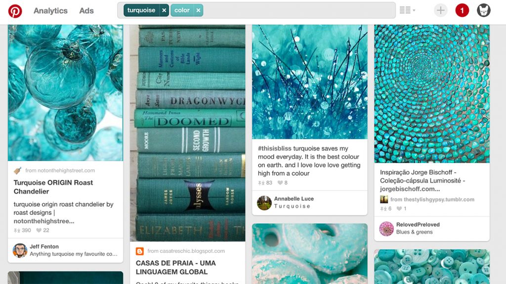
Keep in mind, colors you select online will only look the same online (and different on different screens, browsers, etc.) but if you’re primarily a digital business this can be a totally acceptable way to start. I suggest both Colour Lovers and Pinterest are a great start to get inspired. I always suggest my branding clients create a Pinterest board with their products, images, logo etc. and see what patterns emerge.
We have a fantastic color board on our Pinterest you can use for inspiration
If you already have a version of your color (a cmyk or a pantone) a site like W3 Schools, color-hex or rgb.to (which gives you the hex colors of pantones, cmyk’s etc.) is essential to get you those color codes you need.
2. In Adobe
You can use the ‘eyedropper’ tool to select a color – hover over the color you want to select
Double click on the ‘foreground color’ box (which should now appear to be the color that you’ve just ‘eyedropped’)
The ‘Color Picker’ dialog box will pop up – showing you RGB, CMYK and HEX (#) values for that color (see below)
Adobe: Color Picker
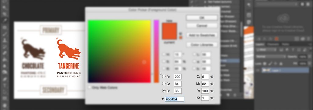
Note: This route is not an exact science.Through this method I find that the values here are not super accurate, so be sure you test your colors and/or check with one of the sites mentioned above in ‘online’.
3. In-Person
a) Pantone
Pricey, but effective, if color is going to be a big part of your world (it was for me when selecting ink for tee printing) then you should invest in Pantone books – choose your poison, you can get tear-off books, books that have both pantone + cmyk and any number of variations – pantone.com
b) Paint
One of my favorite branding color hacks is paint chips. Go to the hardware store or paint specialty store, select the colors you love, take the chips (for free!) and use them as the basis of your brand, then look them up on the manufacturers website for an accurate-as-possible digital version (which you can then drag into Adobe or add to your pinterest board, whatever!) Plus, now you know what color to paint your office BONUS!
OR
Delegate Action:
Provide your designer with colors you like (from any of the sources above) get them to do the heavy-lifiting – matching pantones, finding hex numbers etc. Ask them for their input and listen to their suggestions – that’s why you’re working with a pro!
3. Font
I like having at least 4 brand fonts (sometimes 5) to play with:
- Headline Font (looks great big & bold, like on a poster )
- Sub-title Font (is a perfect fit below that big headline)
- Script or Novelty Font (adds a bit of whimsy, grit or character – used as an accent)
- Body Font (this is often your web font too – something clean, simple and readable for large chunks of text
- Web Font (if your body font is not available online – then this is usually an arial or a times – something that matches as closely as possible to your Body Font)
- Extras: Logo Font, Web fonts in your website, more Novelty fonts, etc.
If you have a ‘wordmark’ or text-based logo, sometimes that font is one of these, sometimes it’s hand drawn or modified so much it’s not available as a font – that doesn’t really matter. What DOES matter is that you are consistent (there it is again!) with the fonts you use, how and where you use them. Trust me, this makes life WAY easier too – not having to decide each time you start a new project, which fonts to use!
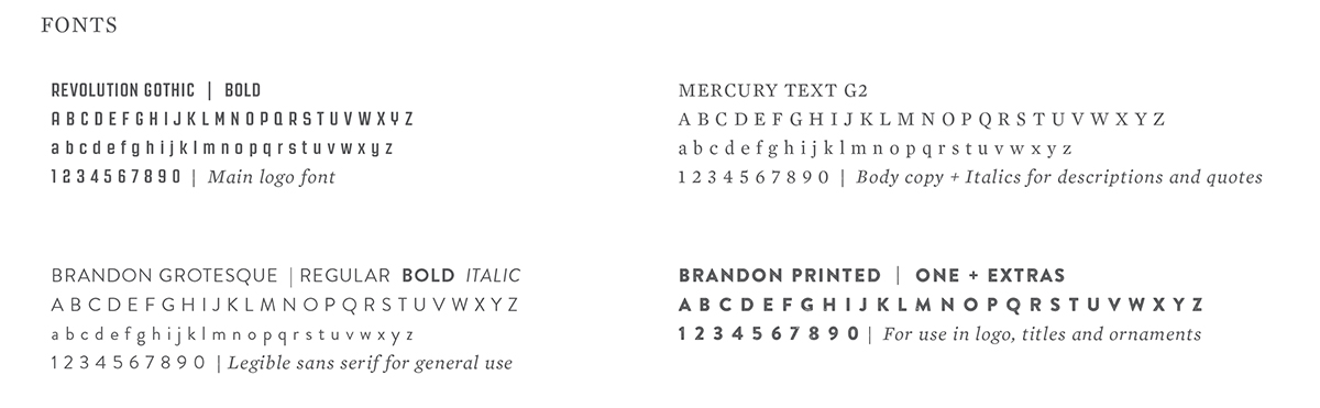
Font is probably the easiest page to put together. Basically, you just need to show the name of the font, a representative of each letter (all caps, all lowercase, or both if you use it in both ways), numbers and a description of what the font should (or shouldn’t) be used for.
Goal
The objective here is to ensure that anyone who creates a banner, flyer etc. would know which fonts to use, where.
Check out how tidy the Labs & Co. fonts are:
Exercise #4: Your Fonts.
![]()
Like exercise #2, if you’re not sure what your ‘signature fonts’ are, find some things (brochures, business cards, web pages etc.) that you’ve created, or ways you’ve used text that you really LIKE. This is probably easiest in the digital form so you can highlight text and see what it is, but if you’re familiar with the fonts (and the ways you use them) then you can simply label them.
If you don’t yet have fonts – you can seriously spiral into a wormhole trying to choose them- Be sure to set a timer so you don’t spend an entire day!
Here are a few great places you can find typefaces (although there are a million more!)
P.S. A great article on the difference between fonts + typefaces if you fancy geeking out on typography!
THEN
D.I.Y Action:
If you don’t have any special design programs, you can use WORD to layout your font like in the example above, and then save the page as a PDF. You can drop this in directly to your document, or open it as an image and drag/drop it into your template.
OR
Delegate Action:
This is one area where designers are VERY VERY helpful. Choosing fonts is a seriously time-consuming endeavor (and can be expensive – the great fonts aren’t free). Plus, you want something that is uniquely ‘yours’ and not just the first thing that comes up in dafont.com or in word when you start typing! Most designers will help you choose fonts as a part of the branding / identity design process.
In Action
Once you have your Guidelines in place, you need to really reign yourself in and work within their beautiful confines. This will help you avoid shiny object syndrome and help you avoid the feeling that you’re ‘reinventing yourself’ each time you create a postcard or a banner ad.
Expert Tips
Design
I suggest that your Brand Guidelines live as a PDF. Ideally one that is both high-quality enough and a small enough file size, to email. You can create this whole project in:
Word / Pages: Go minimal, be sure to use your brand fonts and ‘save as’ a PDF
Canva: A FANTASTIC free design resource, if you haven’t seen it, check it out!
Powerpoint / Keynote: Fab design-cheat and again, save as a PDF
Adobe Suite: Photoshop, Illustrator or In-Design – if you have these tools – use em!
Files
When your Brand Guidelines are complete, I suggest making a series of folders that correspond with the document – both on your primary computer and somewhere on the cloud like Dropbox or Google Drive where it is safe and easy to share with others.
This comes in SUPER handy when you are in a rush, want to share images, need to send logos etc. because they are a click away – instead of an epic, messy search, away. Best of all, even if you’re on the road, not at your not at your computer, on your phone, or dealing with files too big to email you can still access/share them via your chosen cloud solution.
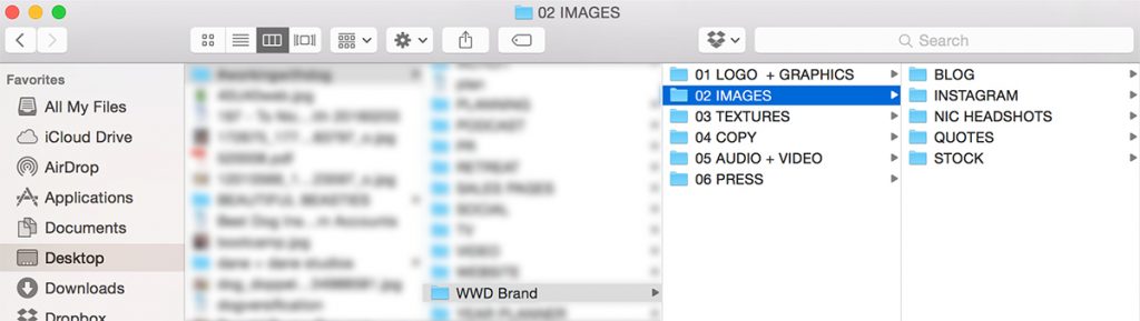
I find this especially handy for me and my team when I just need to grab something to use – don’t need to search through tons of different logo versions, folders, emails etc. to find what I need.
Sample Dog Brand Guidelines
Our resident creative expert, Nat has generously shared some Brand Guidelines with us to help inspire and guide you. Please use these examples to find your own bit of genius – respect Nat and her clients’ copyright and do not copy the brands or brand elements shared here.
We have provided you with these ideas to spark your own. Don’t worry if you haven’t found your ‘ah ha’ yet – it’s there waiting for you – keep digging!
the Natural History of the Urban Coyote
Other Sample Pet Brand Guidelines
Other Sample Non-Pet Brand Guidelines


