![]()
When Facebook bought Instagram for $1 billion four years ago, we all wondered when the corporate slide into monetizing would begin…
Business all had a minor freak-out when the announcement came in March, that like Facebook, our pages ‘reach’ in the Instagram feed was going to have limits [posts no longer showing up chronologically] and Instagram users started to panic, assuming this was the beginning of the end of this platform we love.
Instagram, one of the 10 most popular apps, with over 4 million users is back in the news again this week for the unveiling of the new logo. In a post on Medium instagram explains what went into the new logo, saying:
“The Instagram logo and design was beginning to feel, well… not reflective of the community, and frankly we thought we could make it better”
…and on the instagram blog, a 55 second video tells the story in the way only Instagram should… with images. On the instagram ap there is a video that not-so-subtly explains where the ‘rainbow’ fits in to the whole thing:
the subtext here = ‘the color of your life fuels our ap’ which is very gettable and likable in a ‘Facebook Friends’ campaign kind of way… which, at the time of writing, has 45k+ comments attached to it, mostly users begging Instagram to bring back the old logo + other people telling those people to get over it.
The reactions from the net-o-sphere have been largely negative… Adweek called it a “Travesty” and many people (as they often do when new corporate logos are released that look at all like the original- remember the Starbucks mermaid debate or not being able to find Uber on your phone ‘cuz they changed THEIR logo?) are very passionately declaring that the change is outrageous, unneccessary or that their three year old could have done it better. Plus tons of think pieces and fancy language throwing (especially the word ‘skeuomorphism’, which, by the way, means taking design cues from the real world or realistic things)
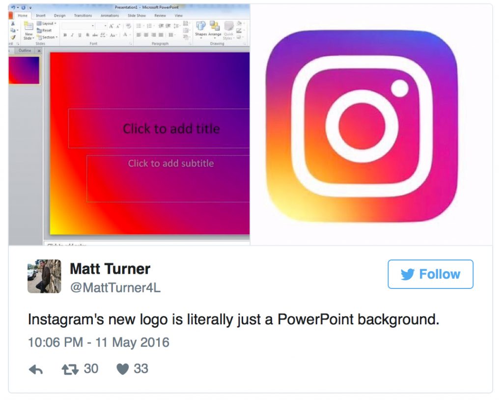
Probably my favorite tweet about the whole thing is this one:
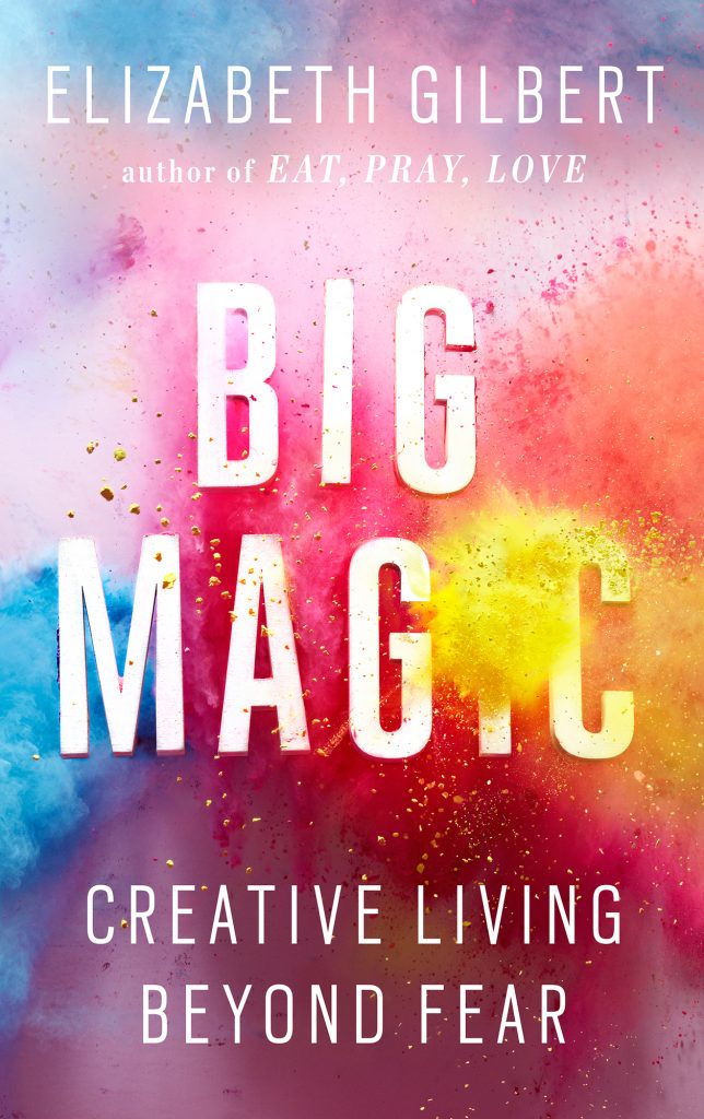
But personally, when I saw the logo, I immediately thought of the Big Magic cover:
…and the current trendy use of the Holika ‘Hindu color festival’ in advertising / design…
I don’t feel strongly about the logo – mostly I like it – and I don’t think you can argue really that instagram’s look definitely needed a bit of an upgrade. But if we’re going to start complaining about upgrades… surely the biggest gripe is why don’t we have a halfway decent iPad interface for Instagram… I mean SERIOUSLY!? What gives??

Anyhow… I updated the ap this morning so I could take a gander and at the changes for myself. Because let’s be honest, changes to the logo don’t really impact us on a day-to-day basis… but changes to the interface, do!
Survey says?
I for one am a fan of the fresh, clean new look inside the ap. It suits my minimalistic aesthetic and the expansive, clean use of white and black + brand accent colors and simplified icons is pleasing. The new insta-experience is definitely a statement in flat design – as all the depth and drop-shadow has disappeared… leaving it to integrate flawlessly and look quite native on my Apple devices…
Although I can’t help but wonder if Instagram has given up a bit of soul in pursuit of modernization?
When discussing the look of the new interface, Ian Spalter, Head of Design for Instagram said:
“While the icon is a colorful doorway into the Instagram app, once inside the app, we believe the color should come directly from the community’s photos and videos. We stripped the color and noise from surfaces where people’s content should take center stage, and boosted color on other surfaces like sign up flows and home screens.”
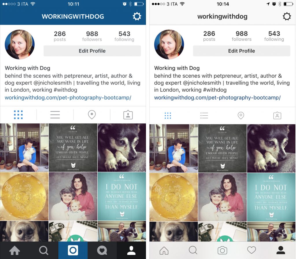
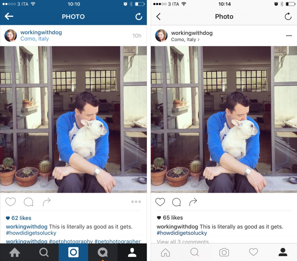
Indeed they did – and I believe this change (perhaps unlike the logo) is a welcome one. See for yourself…
Old [left] & New [right]
Old [left] & New [right]
I especially like way the new interface looks on the desktop…

What do you think about the new logo and interface?
Tell us in the comments below, tweet us @workingwithdog or join the conversation on our brand new Facebook Page!


